THE EDEN
A mobile app design for a restaurant that offers regional, national and global cuisine.

Time
June 2021 - August 2021
Project
Mobile App Design
Category
Case Study
The Problem
Ever tried to make a reservation over a phone call and ended up being seated at the noisiest place for your special night?
Or felt irritated when asked to fill a feedback form after your meal?
The Goal
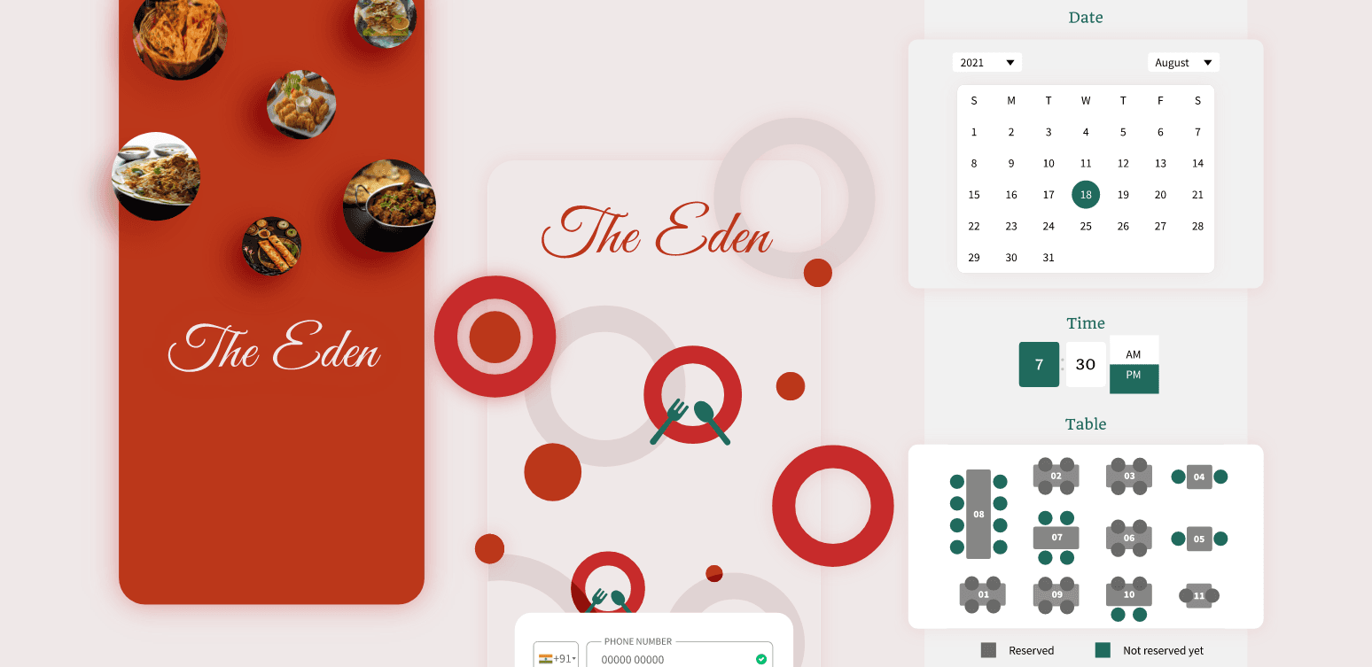
Provide an easier way for users to choose a table during reservation and add a simpler feedback mechanism
EMPATHIZE
What do the users say?
I conducted interviews to qualitatively assess the problems in a fancy restaurant. I also conducted user surveys to understand the users I'm designing for.
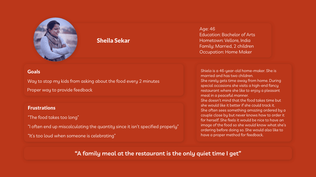
"It's too loud when a group is celebrating"
"It would be nice to have an image of the food"
"We only go to the restaurant for special occasions, so we would like to be seated in a quiet atmosphere"
"We are often in a hurry, so it would be nice to know how long it takes for the food to be delivered"
Pain Points
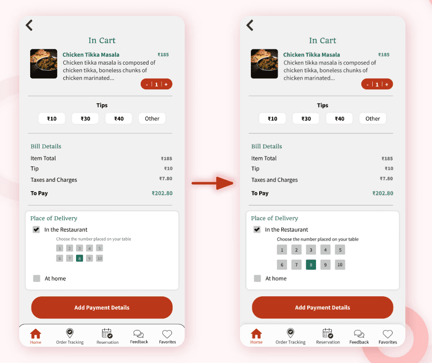
Reservation
Choosing a table without knowing where the table is located in the restaurant is difficult

Feedback
It is difficult to give honest feedback with no motivation
Time
Users are frustrated when they have to wait for the food for an unexpected amount of time
IDEATE
User Persona

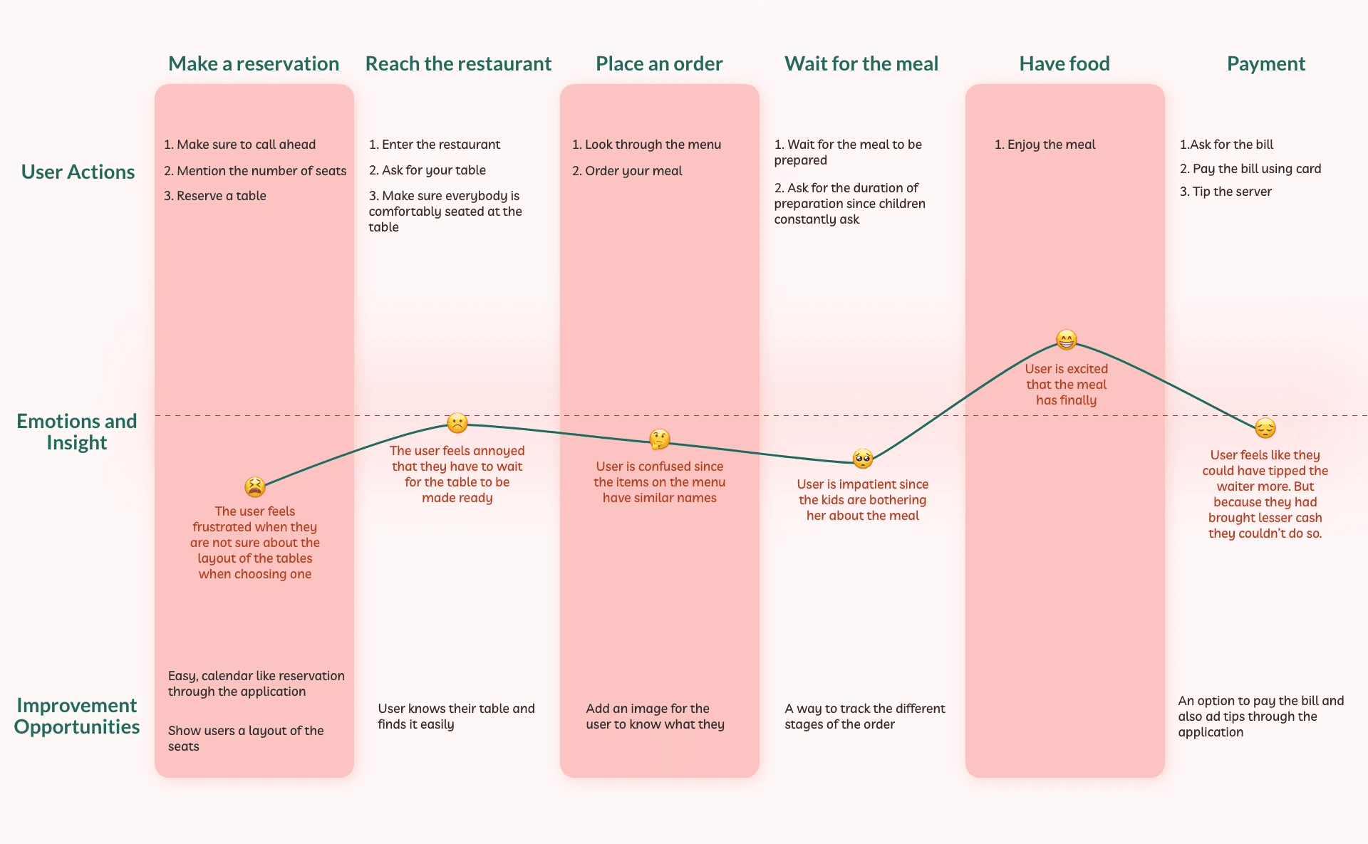
User Journey Map
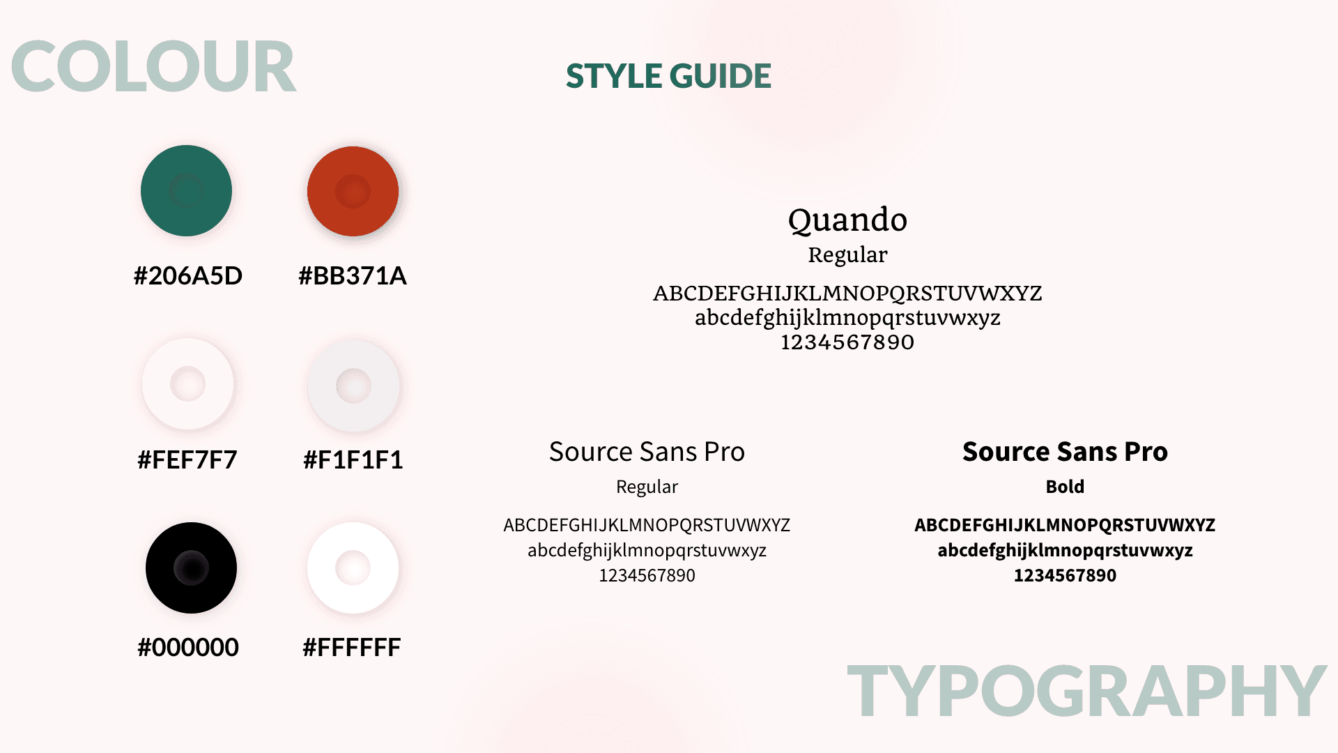
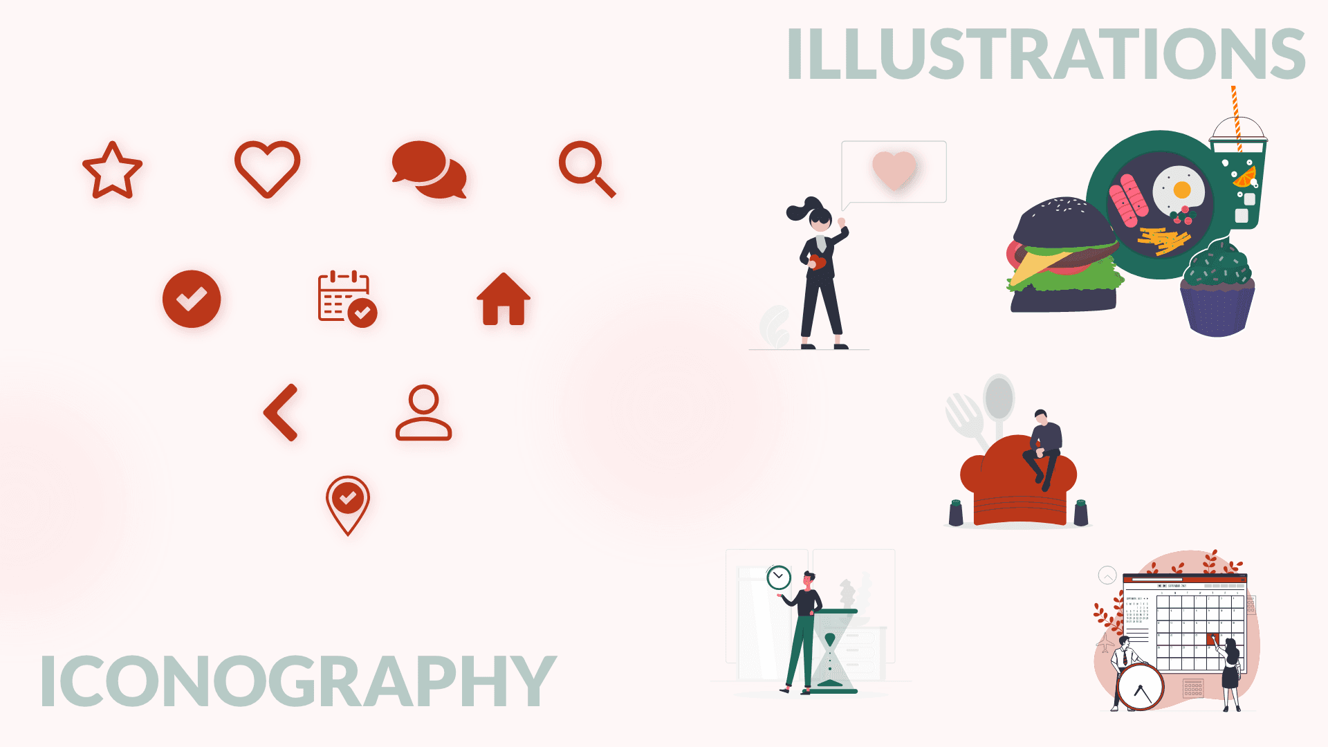
DESIGN
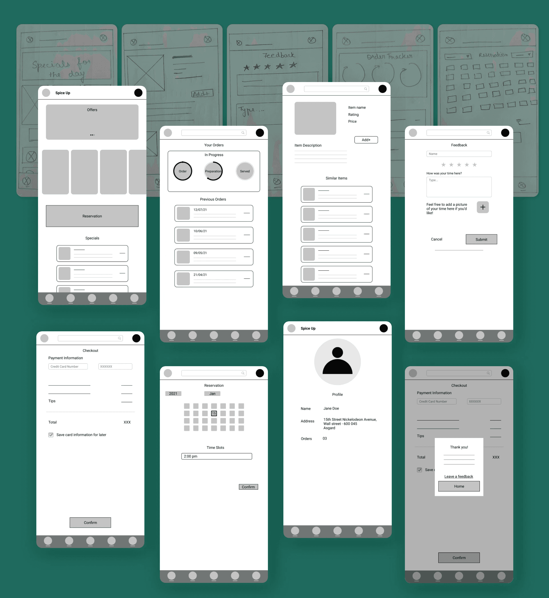
PROTOTYPE
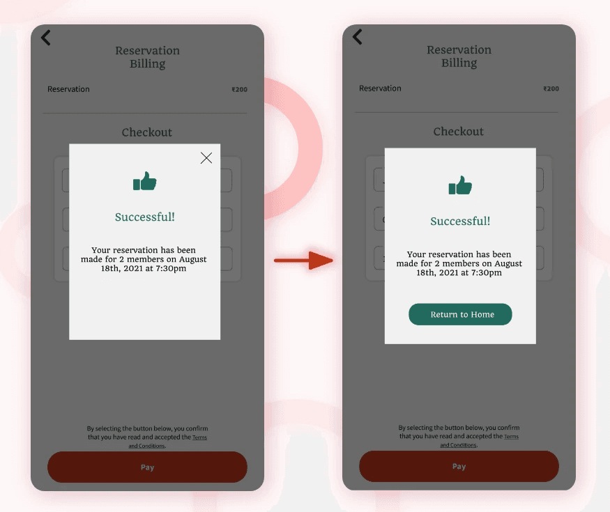
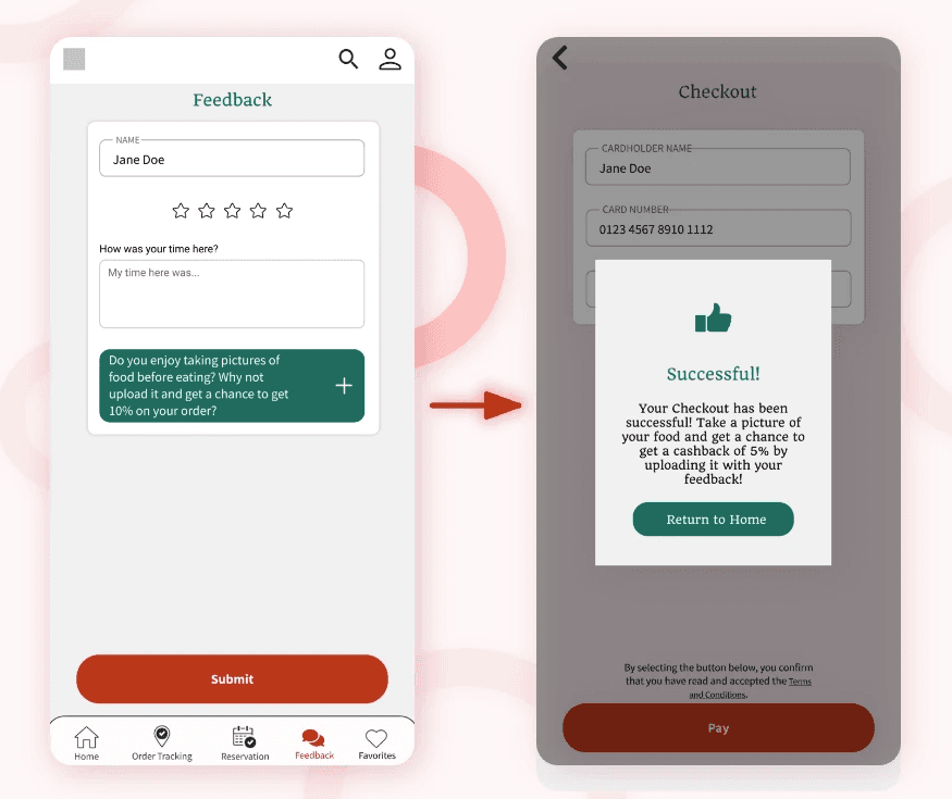
High Fidelity Key Screens

Micro-Interactions


REFLECTIONS
Accessibility considerations

Keeping in mind, users with limited vision, color contrast ratios of the screens have been taken into consideration.

Logout has been made consistent across different screens of the application

Considering users with motor or dexerity impairment, device gestures have been limited to tap and drag
Key Takeaways
While designing the application for The Eden restaurant, I realized that each stage of the design process required continuous feedback to achieve the best possible version of the product. Each iteration of the application was shaped by usability studies and peer feedback.
I’ve learned that even now, the app isn’t complete. There are still many user needs to address and features to incorporate.
Impact
The application made users feel like The Eden restaurant truly valued its customers and thinks about how to make their journey pleasant.
Quote from the usability study
Next Steps
1. Evaluate the current prototype with potential users by conducting usability tests.
2. Enhance the application’s accessibility for users who are not proficient in English.
3. Gather a diverse group of users and conduct additional user research to uncover new areas of user need.